
 Hey folks, I have an extra special treat for you today. A feast for
the eyes as I welcome illustrator, Vanessa Brantley Newton to my blog. Don't you love that dazzling smile?
Vanessa does all kinds of illustration - from magazines to children's books. And she makes dolls, handmade books and a whole variety of crafts! She has a fondness for retro, loves to illustrate people in multicultural situations, and she adores everything about clothing, including drawing them on kids.
She recently finished two children's books:

by Cedella Marley
(Based on the song Three Little Birds by Bob Marley)

and THINK BIG
by Liz Garton Scanlon
Vanessa it's so great to meet you and to see your accomplishments. I'm curious about your process. Let’s say you have a book idea or an assignment in front of you. How do you go about tackling the new project?
Oh my goodness this seems to be the question that I get
asked the most. I have been drawing all my life. I started illustrating
children's books with Scholastic. My very first assignment was for a magazine
called," Read and Rise". I remember the butterflies that I had in my
stomach and the horrible headache that was brought on by fear. The fear of not
doing it right! I finally took a deep breathe and said to myself," These
people have asked YOU to do this because they believe in you. This is what
you have been preparing for all this time now is the time to do it. Do it
scared, but do it." I prayed and put pen to paper and did it. Since then I
have done it almost 35 time now it I tend to take myself through the same thing
each time. It's a little scary each time I do it. I put my faith not so much in
myself or what I can do, but in the Giver of this wonderful gift. He lends me
His genius and it takes the pressure off of me to preform. I send time looking
at the project and doing small sketches. I get to know the characters and do lots
of drawing of the characters. If the book calls for research I spend days
looking for resources that will help me. I also talk to the editors and art
directors as much as possible cause they give me great direction and feedback.
Oh,
I like that line. "Do it scared. But do it." I'm guessing you solicit critical feedback before
submitting your work. Is that true?
I have a wonderful friend in another artist illustrator Eric
Barclay. He lives in Dallas, TX, but we Skype and talk all the time. Eric gets
to see my work and lets me know what he thinks. He is very honest with me and
let's me know if it needs work. The plus is that he is a guy and sometimes guys
just know how to shoot straight with their comments. He doesn't worry about
hurting my feelings. It's about getting the best work out there.
Exactly!
I realize illustrators have to revise just as we writers do. What
kind of revisions might an art director ask for?
There are a lot of revisions that they might ask for like,
making the character a boy instead of a girl. Show a mixed race child. Show a
scene from a different perspective. I once did a character that the art
director hated! She didn't like this guy at all. She asked me to remove him a
couple of times. We went back and forth until another art director told her
that he was in love with the character and felt that he needed to stay just as
he was. It's a give and take situation at time. We work together to make it
happen.

For the cover of Drum City, I offered the publisher several options. Regarding the first one the editor said, "It has a quietness about it. While I love it, it doesn't have the energy of the second one."

LET FREEDOM SING is based on the song, This Little Light of Mine and it celebrates the African-American historical struggle for equality.

This Greensboro Four lunch counter scene is creative and shows both boys and girls.

But Harriet, the editor, wanted it to reflect historical accuracy as well as creativity so she asked me to portray only the four gentlemen involved. "I love Harriet, She is very bold
when she talks to you. She said, 'all black people don't look alike. Put some color in
there.' She wanted to show diversity within color.

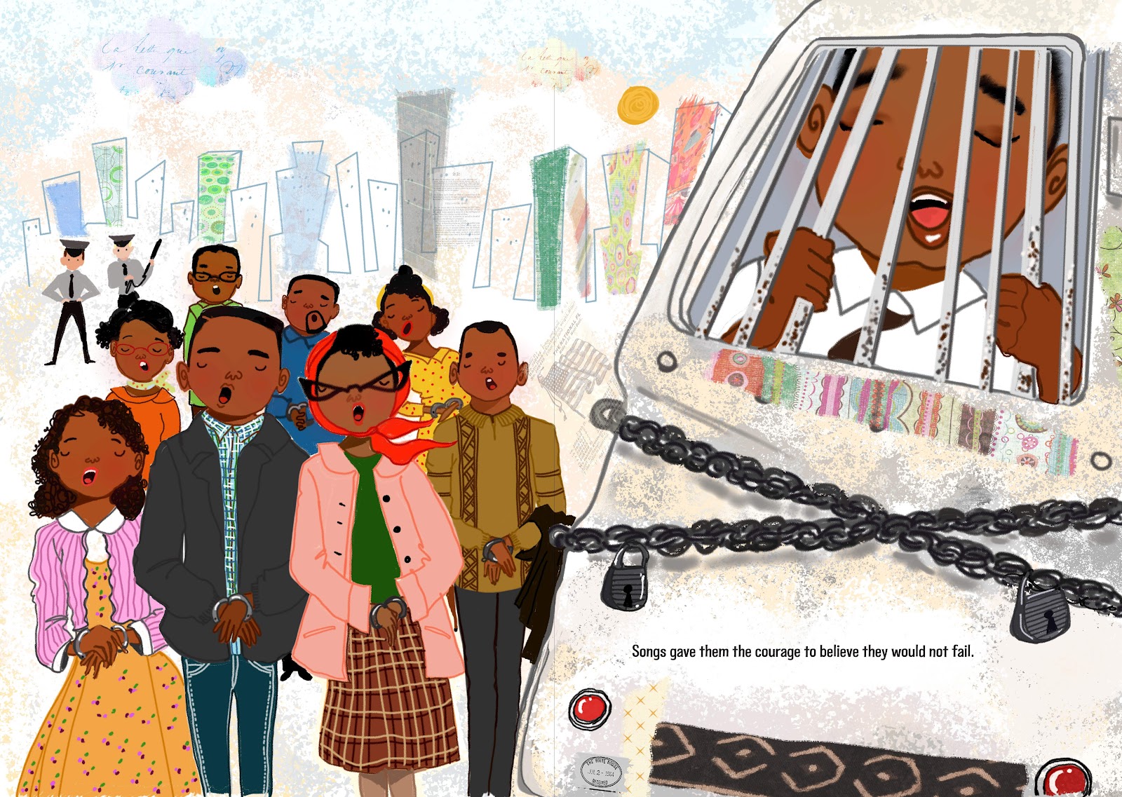
Note the differences in these two illustrations. The first one they loved it but...


the book was not meant to incite. We knew the truth that some people went to jail and died but what was more
important was that what brought us together was the song. (This Little Light of Mine) It was meant to tell a story -
not to make people feel bad. In this revision we see diversity of people standing together.
Vanessa, I love hearing about your process and now I want that book. Thanks so much for sharing a few of your marvelous images with us. We look forward to enjoying many more. Congratulations on your recent publications!


.jpg)